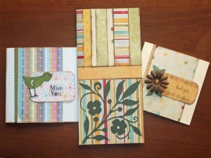
| Here’s my example for the February sketch challenge. Cards are not my strength, I am much better at scrapbook pages, but I do enjoy giving a hand made card. I also love that I use my scraps to make the cards.
The die cuts I used were: Thanks for playing along. I can’t wait to see what you create. Rosalie |
Archives for February 9, 2010
My hubbie’s Valentine Card…
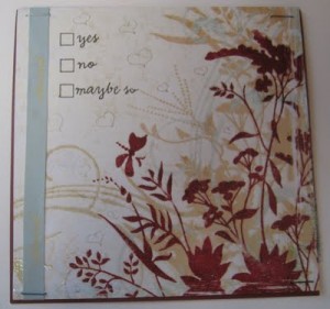
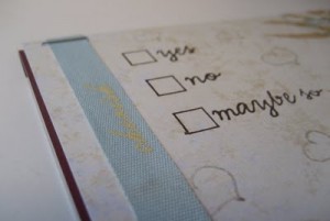
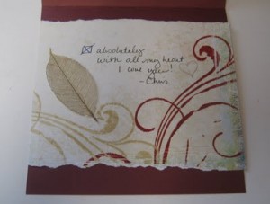
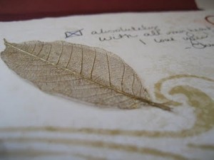
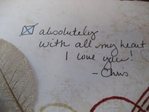
Here is my hubbies Vday card. It is not how it started out, but definitely I am happy with the end results. I always get stumped when trying to make a card for my hubby that is not so over the top and girly. I found this piece of paper. you can’t tell in the picture but the burnt red images are shiny and have a slight glitter touch to them. And there is more of a closeup of the paper further down. I had a stamp I bought on clearance that said yes no maybe so. And the blue staples my friend Lori sent me and at the time I was wondering what I would do with a 5000 box of blue staples, but I really like them and may need to do some searching for more when I make it through my reserves. This ribbon I ran across when organizing my ribbons into these nice oversized Ball Canning jars. More pictures on that later in the week. But when I saw the paper I knew the ribbon would match perfectly.
Chris Durnan, designer at www.visualdesignsbychris.com
GSD KNK WPC AI SCUT files for your personal digital cutters for use with scrapbooking, cardmaking and other hobbies. Whatever your creative mind can come up with!
My files work on many machines. Some of them are: Klik-n-kut, Pazzle, Wishblade, Silhouette, Cricut, Craft Robo. Some of the software involved with these machines are: Funtime, Scrapbooking, WinPC/Signlab, Inkscape, Create & Cut, Illustrator, KNK Studio, Robomaster, DesignMaster and the list goes on….. Enjoy!
And our cutter file “freebies” are kept in the forum. We add to them as we can.
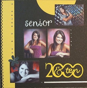
2000 and ten
| Used the 2000 and ten file from VDBC #CD00644. I worked on this layout all weekend and just wasn’t satisfied… too many embellishments. So I decided to go simple and focus on the photos. Which is what we are supposed to do anyway, eh? *smile* So used the KISS (Keep it Simple Silly) method. Created visual triangles with the color yellow and the use of brads.
~Angie~ Visual Designs by Chris Creative Team Member |
